
candy <- read.csv("candy-data.csv")Data Context
The visualization uses FiveThirtyEight’s Candy Power Ranking dataset, whose data context and information can be accessed at this link
Research Question
How does win percentage differ across different sugar levels in candies and differ between chocolate and non-chocolatey ones?
Data Transformation
Code
candy_transformed <- candy %>%
  mutate(sugar_cat = cut(sugarpercent, breaks = c(0, 0.1, 0.2, 0.3, 0.4, 0.5, 0.6, 0.7, 0.8, 0.9, 1), labels = c("0-10%", "11-20%", "21-30%", "31-40%", "41-50%", "51-60%", "61-70%", "71-80%", "81-90%", "91-100%"))) %>%
  mutate(type = ifelse(chocolate == 1, "Chocolate Candy", "Non-Chocolate Candy")) %>%
  group_by(sugar_cat, type)

# dumbbell plot data
dumbbell_data <- candy_transformed %>%
  summarize(avg_win = mean(winpercent)) %>%
  pivot_wider(names_from = type, values_from = avg_win) %>%
  mutate(diff = round(`Chocolate Candy` - `Non-Chocolate Candy`, 2)) %>%
  pivot_longer(cols = c(`Chocolate Candy`, `Non-Chocolate Candy`),
               names_to = "type", values_to = "avg_win")

choco <- dumbbell_data %>%
  filter(type == "Chocolate Candy") %>%
  group_by(type) %>%
  mutate(mean = mean(avg_win))

other <- dumbbell_data %>%
  filter(type == "Non-Chocolate Candy") %>%
  group_by(type) %>%
  mutate(mean = mean(avg_win))

diff <- dumbbell_data %>%
  filter(type == "Non-Chocolate Candy") %>%
  mutate(x_pos = avg_win + (diff/2))

# bar graph data
col_graph_data <- candy_transformed %>%
  summarize(count = n())
Data Visualization
Code
p1 <- ggplot(dumbbell_data) +
  geom_segment(data = other, aes(x = avg_win, y = sugar_cat,
              xend = choco$avg_win, yend = choco$sugar_cat),
              color = "#aeb6bf",
              size = 5.5,
              alpha = .5) +
  geom_point(aes(x = avg_win, y = sugar_cat, color = type), size = 5, show.legend = TRUE) +
  geom_vline(xintercept = other$mean, linetype = "dashed", size = .5, alpha = .8, color = "#6DB025")+
  geom_vline(xintercept = choco$mean, color = "#59260b", linetype = "dashed",  size = .5, alpha = .8) +
  scale_color_manual(values=c("#59260b", "#6DB025")) +
  geom_text(data = diff,
             aes(label = paste("D: ",abs(diff)), x = x_pos, y = sugar_cat),
             color = "#4a4e4d",
             size = 2.5) +
  labs(x = "Average Win Percentage", y = "Sugar Percentage in Candies") +
  geom_text(data = other, aes(x = other$mean - 1.5, y = "91-100%"), label = "MEAN", angle = 90, size = 2.5, color = "#6DB025", vjust = 1)+
  theme_classic() +
  theme(legend.title = element_blank(),
        panel.background = element_rect(fill = "#f5f5f4"),
        axis.text.x = element_text(size = 8),
        axis.text.y = element_text(size = 8),
        axis.title = element_text(size = 10))

p2 <- ggplot(col_graph_data) +
  geom_col(aes(x = count, y = sugar_cat, fill = type), width = 0.5) +
  scale_fill_manual(values=c("#59260b", "#6DB025")) +
  scale_x_continuous(limits = c(0, 12), breaks = c(0,2,4,6,8,10,12)) +
  labs(x = "Number of Candies") +
  theme_classic() +
  theme(legend.position = "none", axis.title.y = element_blank(), axis.text.y = element_blank(),
        axis.line.y = element_blank(), axis.ticks.y = element_blank(),
        panel.background = element_rect(fill = "#f5f5f4"),
        axis.text.x = element_text(size = 8),
        axis.title = element_text(size = 10))


main_plot <- ggarrange(p1, p2, ncol = 2, widths = c(2.2, 0.75), align = "h",common.legend = TRUE)

annotate_figure(
      annotate_figure(main_plot, top = text_grob("The number of candies per sugar level are provided to compare the denominator of average win.", size = 8, face = "italic")),
      top = text_grob("Average Win Percentage per Sugar Level and Chocolate-ness in Halloween Candies",
              size = 12, face = "bold"))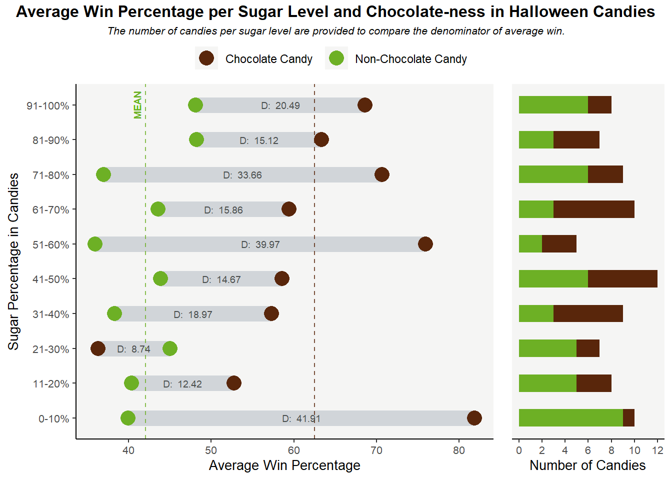
Discussion
A lot of people like candies due to their sweetness, and chocolate candy is a staple on Halloween, so I thought it would be interesting to examine these factors in relation to win percentage. My initial hypothesis was that sweetness level is positively correlated to winning percentage, and chocolate candies would have a higher winning percentage compared to non-chocolate candies.
To verify this hypothesis, I created a dumbbell plot in R to visualize the different winning percentages, on average, between chocolate and non-chocolate candies, across different sugar levels. I put the sugar categories on the y-axis and the average win percentage on the x-axis, a trade-off due to information density reason since while we perceive length differences along the y-axis as more important than horizontal position (Munzner, 118), the x-axis is capable of displaying more information across multiple categories. Meanwhile, chocolate and non-chocolate candies are represented by different colors: brown for chocolate (for obvious reasons), and green for non-chocolate ones because I need a color in good contrast with the shade of brown I select to make the comparison stand out.
I prefer the dumbbell plot to its alternative, a clustered bar chart in this case because since there are 10 sweetness categories, a clustered bar chart would make the chart look crowded and thus harder to interpret. Adding the actual differences in winning percentage between chocolate and non-chocolate candies (annotated as “D: …” text in the graph) in a dumbbell chart also looks cleaner compared to a bar chart. In addition, two color-coded, dashed, vertical lines representing the mean winning percentage of each candy type are added to the graph to help the audience compare the winning percentage of the candy type in each sweetness category with its mean percentage. More importantly, the distance between the 2 mean lines helps us quantify the difference in average winning percentage between chocolate and non-chocolate candies and partially answers our research question: yes, chocolate candies do have a higher average winning percentage than non-chocolate ones.
I also include a subplot, a stacked bar chart that displays the number of candies per sweetness category to the right of the main plot. Since people tend to read from left to right in the US, the subplot is deliberately placed on the right side and is designed to have a smaller size to draw focus to the main plot. The subplot is also color-coded to differentiate between the number of candies for chocolate and non-chocolate types. The purpose of this subplot, as explained in the subtitle, is to facilitate understanding of the denominators that are used to calculate the average winning percentage. While we do see that chocolate candies tend to have higher winning percentages across sugar levels, since the main plot only displays the average percentage, it leads to the question that the winning percentage of non-chocolate candies might be made lower since it is divided by a larger number of candies or due to the effect of some outliers, etc. As a result, the subplot offers us more insight into the scale with which the average win is calculated to foster transparency. A weakness of the graph, however, is that it did not give the audience information on whether there are any outliers in winning percentages that might skew the average winning results. I also chose the stacked bar chart format so the audience can also see the total number of candies per sugar category: it can be seen that each sugar level has a relatively similar number of candies, so the comparison across sugar levels is more reliable.
I transformed the sugar percent variable from quantitative to a new categorical variable that represents sugar level (10 – 20%, etc.). While it is possible to gauge the correlation between win percentage and sugar percentage with a quantitative sugar percent variable, I decided to turn it to categorical because (1) most people do not distinguish between 42% and 50% sugar percentage so it’s reasonable to group them into the same category (2) it is easier to get the exact difference in winning percentage across sugar categories between chocolate and non-chocolate candies, as opposed to across sugar percentages (since in this case it only makes sense to subtract the winning percentage between 2 candies with the exact same sugar percentage, which is rare). We can see from the graph that sugar level does not seem to have a significant correlation with winning percentage, however, which goes against our initial hypothesis.
Bibliography
Munzner, T. (2014). “Visualization Analysis and Design”. A K Peters Visualization Series, CRC Press, 2014. https://www.cs.ubc.ca/~tmm/vadbook/